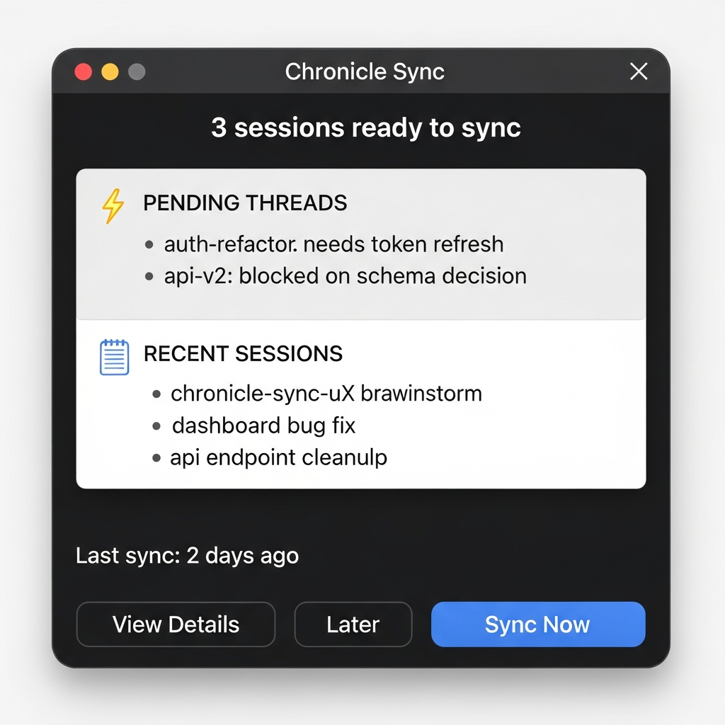
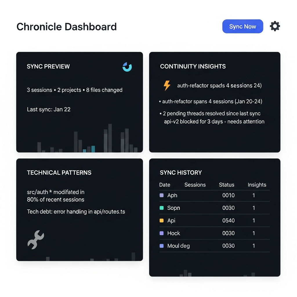
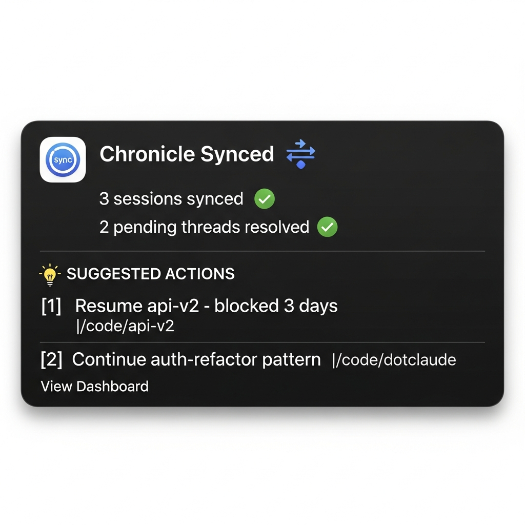
What is Chronicle Sync UX? An enhanced sync experience for Chronicle that transforms the daily popup from a simple "sync now?" confirmation into a momentum tool showing pending work, insights, and actionable next steps.
Key Design Constraints:
- macOS native: Uses osascript dialogs and notifications
- Progressive disclosure: Quick info in popup, depth in dashboard
- Feedback-driven: Track clicks on suggestions to improve over time
Target Users: Developers using Claude Code who context-switch frequently
What We're Looking For:
- Does the popup provide enough context at a glance?
- Are the insights categories (continuity, technical, cross-project) valuable?
- Do the suggested actions feel actionable and helpful?